- From: Kevin Mack <kmack418@gmail.com>
- Date: Mon, 20 Oct 2014 13:02:29 -0400
- To: "Hall, Charles (DET-MRM)" <Charles.Hall@mrm-mccann.com>
- Cc: "public-respimg@w3.org" <public-respimg@w3.org>
- Message-ID: <CALvLtk7oo8XtcWBfify9ppyui8ocB6qsdiMiZqZ8xsfMtR6F_g@mail.gmail.com>
The comma is how @media uses multiple media types, I see it working the
same way.
On Monday, October 20, 2014, Hall, Charles (DET-MRM) <
Charles.Hall@mrm-mccann.com> wrote:
> This absolutely makes more sense.
> The expression in the query is against the *element* properties – either
> independently (your original example), or within media type properties
> (second example).
>
> The syntax in that case may need some love, as the comma serves as the
> logical operator ‘*or*’.
>
> So this:
> @media screen and (max-width: 800px), *.zone--b and (min-width: 600px)* {
> }
>
> Might be this:
> @media screen and (max-width: 800px) and *.zone--b and (min-width: 600px)* {
> }
>
> *Charles Hall*
> UX Architect, Technology
>
> t / 248.203.8723 m / 248.225.8179
> e / charles.hall@mrm-mccann.com
> <javascript:_e(%7B%7D,'cvml','charles.hall@mrm-mccann.com');>
> skype / charles.h.all
> 360 West Maple Road, Birmingham MI 48009
> w / www.mrmworldwide.com
>
> Creativity. Technology. Performance.
>
> From: Kevin Mack <kmack418@gmail.com
> <javascript:_e(%7B%7D,'cvml','kmack418@gmail.com');>>
> Date: Monday, October 20, 2014 at 12:24 PM
> To: "Charles Hall (DET-MRM)" <charles.hall@mrm-mccann.com
> <javascript:_e(%7B%7D,'cvml','charles.hall@mrm-mccann.com');>>
> Cc: "public-respimg@w3.org
> <javascript:_e(%7B%7D,'cvml','public-respimg@w3.org');>" <
> public-respimg@w3.org
> <javascript:_e(%7B%7D,'cvml','public-respimg@w3.org');>>
> Subject: Re: Element Query and Selector Media Query Types
>
> That's an interesting approach to. Let me show you an example of what
> I'm thinking:
>
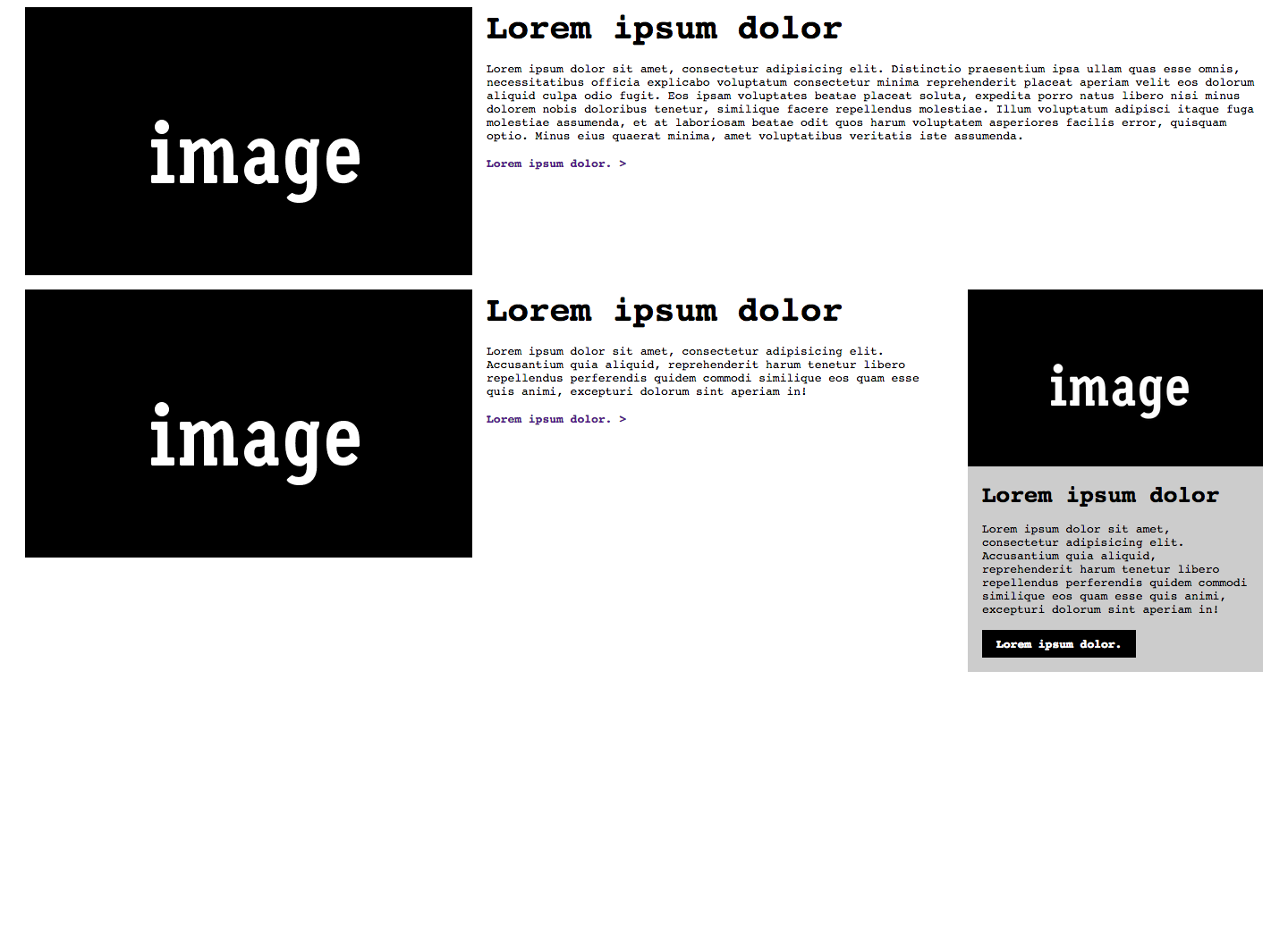
> Here is a wider screen view using the same module (.media) but in three
> uses in the same layout:
>
>
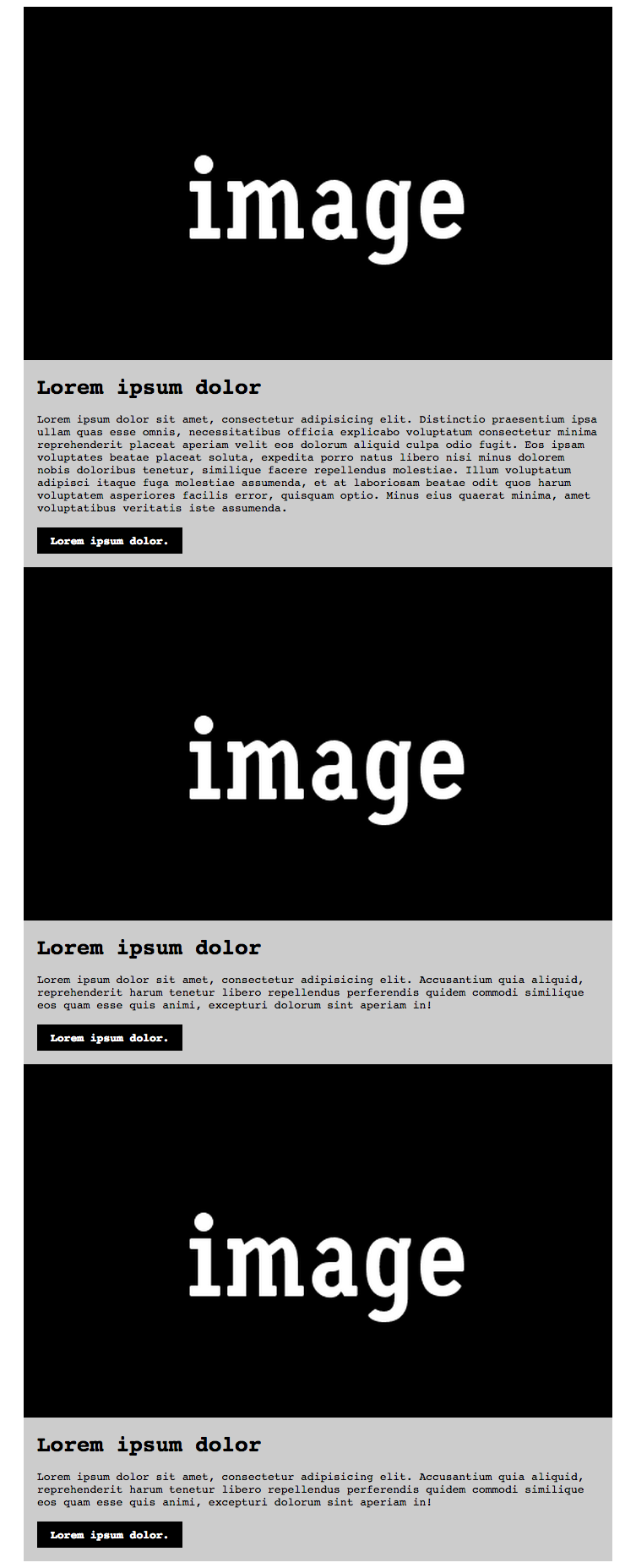
> And here's the same at a smaller:
>
>
>
>
> Now this looks like a typical feature/type approach to RWD (and this can
> be done pretty easily). The big difference is that the last .media is
> rendered as the smaller view version at a larger view, how this is done is
> because it's based off of the parent container's width (.zone--b). Here's
> what this code would look like:
>
> *HTML*
> <div class="container">
> <div class="media">
> <div class="media__asset">
> <img class="image-full" src="
> http://placehold.it/500x300/000000/FFFFFF&text=image" />
> </div>
> <div class="media__details">
> <h3 class="media__title">
> Lorem ipsum dolor
> </h3>
> <p class="media__detail__content">
> Lorem ipsum dolor sit amet, consectetur adipisicing elit. Distinctio
> praesentium ipsa ullam quas esse omnis, necessitatibus officia explicabo
> voluptatum consectetur minima reprehenderit placeat aperiam velit eos
> dolorum aliquid culpa odio fugit. Eos ipsam voluptates beatae placeat
> soluta, expedita porro natus libero nisi minus dolorem nobis doloribus
> tenetur, similique facere repellendus molestiae. Illum voluptatum adipisci
> itaque fuga molestiae assumenda, et at laboriosam beatae odit quos harum
> voluptatem asperiores facilis error, quisquam optio. Minus eius quaerat
> minima, amet voluptatibus veritatis iste assumenda.
> </p>
> <a class="media__details__cta" href="#">
> Lorem ipsum dolor.
> </a>
> </div>
> </div>
>
> <div class="zone--a">
> <div class="media">
> <div class="media__asset">
> <img class="image-full" src="
> http://placehold.it/500x300/000000/FFFFFF&text=image" />
> </div>
> <div class="media__details">
> <h3 class="media__title">
> Lorem ipsum dolor
> </h3>
> <p class="media__detail__content">
> Lorem ipsum dolor sit amet, consectetur adipisicing elit. Accusantium quia
> aliquid, reprehenderit harum tenetur libero repellendus perferendis quidem
> commodi similique eos quam esse quis animi, excepturi dolorum sint aperiam
> in!
> </p>
> <a class="media__details__cta" href="#">
> Lorem ipsum dolor.
> </a>
> </div>
> </div>
> </div>
>
> <div class="zone--b">
> <div class="mediab">
> <div class="mediab__asset">
> <img class="image-full" src="
> http://placehold.it/500x300/000000/FFFFFF&text=image" />
> </div>
> <div class="mediab__details">
> <h3 class="mediab__title">
> Lorem ipsum dolor
> </h3>
> <p class="mediab__detail__content">
> Lorem ipsum dolor sit amet, consectetur adipisicing elit. Accusantium quia
> aliquid, reprehenderit harum tenetur libero repellendus perferendis quidem
> commodi similique eos quam esse quis animi, excepturi dolorum sint aperiam
> in!
> </p>
> <a class="mediab__details__cta" href="#">
> Lorem ipsum dolor.
> </a>
> </div>
> </div>
> </div>
>
> </div>
>
>
> *CSS*
>
>
> body {
> font-family: monospace;
> }
>
> * {
> box-sizing: border-box;
> }
>
> .image-full {
> display: block;
> height: auto;
> width: 100%;
> }
>
> .container {
> max-width: 1400px;
> }
>
> .container:after {
> content: "";
> clear: both;
> display: table;
> width: 100%;
> }
>
> @media screen and (min-width:1440px) {
> .container {
> margin-left: auto;
> margin-right: auto;
> }
> }
>
> @media screen and (max-width:1440px) {
> .container {
> margin-left: 20px;
> margin-right: 20px;
> }
> }
>
> @media screen and (min-width: 800px) {
> .zone--a, .zone--b {
> float: left;
> }
>
> .zone--a {
> width: 75%;
> }
>
> .zone--b {
> padding-left: 1rem;
> width: 25%;
> }
> }
>
> .media {
> padding-bottom: 1rem;
> }
>
> .media__title, .media__detail__content {
> margin-bottom: 1rem;
> }
>
> .media__details {
> padding-left: 1rem;
> }
>
> .media__detail__content {
> margin-top: 0;
> }
>
> .media__details__cta {
> font-weight: 700;
> text-decoration: none;
> }
>
> @media screen and (min-width: 800px) {
> .media {
> display: table;
> width: 100%;
> }
>
> .media__asset,.media__details {
> display: table-cell;
> vertical-align: top;
> }
>
> .media__asset {
> width: 500px;
> }
>
> .media__title {
> margin-top: 0;
> font-size: 3em;
> }
>
> .media__details {
> padding-left: 1rem;
> }
>
> .media__details__cta:after {
> content: ">";
> }
> }
>
> @media screen and (max-width: 800px), *.zone--b and (min-width: 600px)* {
> .media {
> background-color: #ccc;
> }
>
> .media__title {
> font-size: 2em;
> margin-top: 1rem;
> }
>
> .media__details__cta {
> background-color: #000;
> color: #FFF;
> display: inline-block;
> padding: .5rem 1rem;
> }
>
> .media__details {
> padding-right: 1rem;
> }
> }
>
>
>
> Looking at the code above, using *.zone--b and (min-width: 800px)*makes
> the design change based off of the parent's width of .zone--b. zone--b is
> rendered at 350px at larger viewport (25% of the 1400px of .container).
> This covers the case for parent-child selector query and then aligns with
> viewport to selector (traditional) and how they can be used together.
>
> Does this help or add more confusion?
>
>
> On Mon, Oct 20, 2014 at 11:25 AM, Hall, Charles (DET-MRM) <
> Charles.Hall@mrm-mccann.com
> <javascript:_e(%7B%7D,'cvml','Charles.Hall@mrm-mccann.com');>> wrote:
>
>> Hi Kevin,
>>
>> I’m not entirely clear on your use cases.
>>
>> My understanding of @media queries:
>> Conditionally check for media type (print, screen, all), then any number
>> and/or type of expressions (height, orientation, color), then any explicit
>> or range of value (60em, 25%, 50vw) and apply what follows when all produce
>> a match.
>>
>> So, in the case of Element queries, I believe that they would check for
>> element type (<aside>, <input>, <blockquote>), then any number and/or type
>> of attributes (dir=, target=, data-name=), then any explicit or partial
>> value ("ltr", "#top", "mathBox"), then any other condition required, and
>> apply what follows when all produce a match – simply now in CSS, and no
>> longer limited to JS/jQuery.
>>
>> A use case could be: “I have 2 dynamic aside elements that share
>> multiple classes and attributes and I need a simple CSS selector that does
>> not require source order or complex combinators.”
>>
>> The structure and syntax in this case would be something like this:
>>
>> @element aside and (data-name="mathBox") {
>> fieldset { border: 1px solid red; }
>> }
>>
>> This of course can currently be written with an attribute selector
>> (below), but I wanted to write a very simple syntax as a starting point.
>>
>> fieldset [data-name="mathBox"] { border: 1px solid red; }
>>
>> I hope this adds another perspective to the conversation.
>>
>> Thanks,
>>
>>
>> *Charles Hall*
>> UX Architect, Technology
>>
>> t / 248.203.8723 m / 248.225.8179
>> e / charles.hall@mrm-mccann.com
>> <javascript:_e(%7B%7D,'cvml','charles.hall@mrm-mccann.com');>
>> skype / charles.h.all
>> 360 West Maple Road, Birmingham MI 48009
>> w / www.mrmworldwide.com
>>
>> Creativity. Technology. Performance.
>>
>> From: Kevin Mack <kmack418@gmail.com
>> <javascript:_e(%7B%7D,'cvml','kmack418@gmail.com');>>
>> Date: Monday, October 20, 2014 at 9:45 AM
>> To: "public-respimg@w3.org
>> <javascript:_e(%7B%7D,'cvml','public-respimg@w3.org');>" <
>> public-respimg@w3.org
>> <javascript:_e(%7B%7D,'cvml','public-respimg@w3.org');>>
>> Subject: Re: Element Query and Selector Media Query Types
>> Resent-From: <public-respimg@w3.org
>> <javascript:_e(%7B%7D,'cvml','public-respimg@w3.org');>>
>> Resent-Date: Monday, October 20, 2014 at 9:46 AM
>>
>> Wanted to see if anyone else had any thoughts/opinions on *Element
>> Query and Selector Media Query Types*? I want to really start pushing
>> these but I want to make sure that I have support of the community and
>> these have been thought-through.
>>
>> Let me know, it's very appreciated // Thank you!
>> *Kevin Mack*
>>
>> On Sun, Oct 12, 2014 at 4:39 PM, Kevin Mack <kmack418@gmail.com
>> <javascript:_e(%7B%7D,'cvml','kmack418@gmail.com');>> wrote:
>>
>>> Hello hello!
>>>
>>> With the success of Picture Element/@srcset, I feel we should continue
>>> the momentum. I have a suggestion for two new media-query types, they are:
>>> *content* and "*selector*" (including pseudo selectors) queries. Both
>>> would utilize the same media-query features that already exist and extend
>>> the use of media-queries to create more modular, portable, reusable code.
>>>
>>> The idea is have a solutions for the "Element Query" and "Content
>>> Query", which has been handled frequently by JavaScript.
>>>
>>>
>>> The* Element Query* would work similar to how an iframe works within a
>>> container – the container has the constraints of width and the content
>>> inside the iframe has a client width of the container.
>>>
>>> Here's one use-case of what I imagine the Element Query working like:
>>>
>>> *<style>*
>>> *.container {*
>>> *max-width: 1000px;*
>>> *margin-right: auto;*
>>> *margin-left: auto;*
>>> *}*
>>>
>>> *.nav {*
>>> *display: block;*
>>> *margin-top: 0;*
>>> *margin-bottom: 0;*
>>> *padding-left: 0;*
>>> *list-style: none;*
>>> *}*
>>>
>>> *@media .nav and (max-width: 800px) {*
>>> *.nav__item {*
>>> *display: block;*
>>> *}*
>>> *}*
>>>
>>> *@media .nav and (min-width: 801px) {*
>>> *.nav__item {*
>>> *display: inline-block;*
>>> *}*
>>> *}*
>>> *</style>*
>>>
>>> *<div class="container">*
>>> *<ul class="nav">*
>>> *<li class="nav__item">*
>>> *<a href="#">*
>>> *Lorem ipsum dolor*
>>> *</a>*
>>> *</li>*
>>> *<li class="nav__item">*
>>> *<a href="#">*
>>> *Consectetur adipisicing elit*
>>> *</a>*
>>> *</li>*
>>> *<li class="nav__item">*
>>> *<a href="#">*
>>> *Impedit ut accusamus*
>>> *</a>*
>>> *</li>*
>>> *<li class="nav__item">*
>>> *<a href="#">*
>>> *Lorem ipsum dolor*
>>> *</a>*
>>> *</li>*
>>> *</ul>*
>>> *</div>*
>>>
>>>
>>> Second is the *Content Query* that's best described in this example:
>>> if I have two headlines, "This Is My Title" and "This Is A REALLY Long
>>> Title for a Section". If the content has a max-width of 30em, then apply a
>>> fixed max-width to make the title look "more presentable" at a larger
>>> viewport.
>>>
>>> *<style>*
>>> *@media content and (min-width: 30em) {*
>>> *.section-title {*
>>> *max-width: 16em;*
>>> *}*
>>> *}*
>>> *</style>*
>>>
>>>
>>> *<h1>*
>>> *This Is A Title*
>>> *</h1>*
>>>
>>> *<h1 class="section-title">*
>>> *This Is A REALLY Long Title*
>>> *for a Section*
>>> *</h1>*
>>>
>>>
>>> I am eager to see solutions like these in place, it would dramatically
>>> reduce development time and promote best practices for developing CSS/HTML
>>> in a responsive experience.
>>>
>>>
>>>
>>> Thoughts?
>>> - *Kevin Mack*
>>>
>>>
>>
>
Attachments
- image/png attachment: larger.png
- image/png attachment: smaller.png
- image/png attachment: 5D510C5C-1CCD-479C-A466-98D1FC580B9B_11_.png

- image/png attachment: 5D510C5C-1CCD-479C-A466-98D1FC580B9B_12_.png

Received on Monday, 20 October 2014 17:03:00 UTC