- From: Katie Haritos-Shea <ryladog@gmail.com>
- Date: Wed, 14 Aug 2019 21:37:10 -0400
- To: Andrew Somers <me@andysomers.com>
- Cc: AlastairCampbell <acampbell@nomensa.com>, Jonathan Avila <jon.avila@levelaccess.com>, public-low-vision-a11y-tf <public-low-vision-a11y-tf@w3.org>
- Message-ID: <CAEy-OxH-iqbAX_WbyA9jbkz7w-maU1qx1a12ZUiDKs1EfuYSWA@mail.gmail.com>
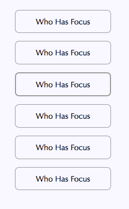
I like where this is going for Silver!

On Wed, Aug 14, 2019, 8:35 PM Andrew Somers <me@andysomers.com> wrote:

> Some variety of comments below, also repeats I sent to Alastair separately
> forgetting to include the list.
>
> On Aug 13, 2019, at 1:21 AM, Alastair Campbell <acampbell@nomensa.com>
> wrote:
>
> SNIP
>
> Without the thickness/separation requirement this would pass the proposed
> SC, which is equivalent to adding a 1px black outline to a solid black
> button:
> <image001.png>
>
> For those struggling to see it, there is a 1px red line around the
> left-hand solid blue button.
>
> The changed pixels are going from white to dark red, so meet 3:1. However,
> the blue-red contrast ratio is 1:1.6, so if you can’t discern the hue then
> it is just a slightly thicker button.
>
>
> Essentially everyone except a true “monocrhromat” (no color perception at
> all) can distinguish between red and blue, with the following notes:
>
>
>    - Protanopia can distinguish blue and “red or green” as distinctly
>    different, but red will appear darker (about 25%-30% perceptually darker on
>    an sRGB monitor)
>    - Deuteranopia can distinguish blue and “red or green” as distinctly
>    different.
>    - Tritanopia will see the blue as black, and can distinguish the red.
>
> But IMO even normal vision would have a problem with such a fine line
> there.
>
> AND:
>
> A cardinal rule of design is *color* as in hue* should not
> be necessary for legibility” —if it does not work in greyscale, then it
> does not work as a design choice. The examples I have below are all in
> greyscale:
>
>
> Also to repeat some of what I said in an email that didn’t get to the
> list: 1px as a *sole* indicator is likely not enough. Here are some of
> the examples and related thoughts:
>
>
> *A 1px line needs much more contrast than a 12px line.* This is something
> that is evolving relating to Silver (contrast based on spatial frequency).
> A 12 px line around a box for focus might work fine with less than 2:1
> contrast. A 1px line needs more. On the left, 1px at 3:1 In the middle 12px
> at 1.9:1, on the right 1px at 1.9:1
>
>
> *A second consideration with focus: *The need for a distinctive “change”
> depends *partly* on if it is in a group of similar items close together,
> or the focus is relative some dissimilar items far apart. If items are far
> apart, and shaped and sized differently, then I’d submit that they need
> more distinction than if they are in, say, a column of 5 similar items.
>
> ...as opposed to this cluttered example (intentionally chaotic) :
>
>
> In both cases focus is a 2px border instead of a 1px.
>
> And finally, if you have 5 items with a box around them, and the manner of
> indicating focus is just  to change the contrast of one of the boxes, are
> you specifying a contrast change amount? Or a size change?
>
>
> *SIZE contrast can be important here.* In the bottom example, they all
> have a 1px border, and that border is 3:1 contrast relative to the grey
> button. And the FOCUS is an *additional* 3:1 in CHANGE from the other
> buttons. Yet it is still VERY hard to see. Simply having a border be 3:!
> contrast different than the others isn’t enough.
>
> In other words, *everything* below has 3:1 contrast from its nearest
> adjacent pixel.
>
>
> For the record the one with focus is the fourth one down. So in a context
> like this, simply varying the contrast of the border is not enough, even
> though EVERYTHING is 3:1 OR MORE in all directions including the change of
> focus.
>
>
> A 1px border is similar to a small, thin font. Small thin fonts should be
> in the 9:1 and higher contrasts, and in this last example, a 3:1 contrast
> variation (using WCAG math which does have some issues in this regard) is
> not enough in this case for change.
>
>
> BUT here is a 1px border, that is set at 1 px away (left) or 2 pixels away
> (right)
>
>
>
>
> The following box-shadow property puts a solid 1px border 3px away from
> the button without changing center to center vertical spacing, as in the
> example on the right:
>
> box-shadow: 0 0 0 3px #FFF, 0 0 0 4px #666;
>
> In closing, a 1px border add MAY be enough or MAY NOT depending on CONTEXT
> of use.
>
>
> *Andrew Somers*
> *Color Science Researcher*
> (contact redacted for list)
>
>
>
>
Attachments
- image/png attachment: Screen_Shot_2019-08-14_at_3.13.11_PM.png

- image/png attachment: Screen_Shot_2019-08-14_at_2.43.51_PM.png

- image/png attachment: Screen_Shot_2019-08-14_at_3.21.29_PM.png

- image/png attachment: Screen_Shot_2019-08-14_at_3.03.40_PM.png
- image/png attachment: Screen_Shot_2019-08-14_at_5.20.33_PM.png

- image/png attachment: Screen_Shot_2019-08-14_at_5.20.11_PM.png

Received on Thursday, 15 August 2019 01:38:17 UTC