- From: Alan Gresley <alan@css-class.com>
- Date: Fri, 13 Dec 2013 01:38:25 +1100
- To: Rik Cabanier <cabanier@gmail.com>
- CC: Lea Verou <lea@verou.me>, Michael Mullany <michael@sencha.com>, Dean Jackson <dino@apple.com>, "public-fx@w3.org" <public-fx@w3.org>, www-style list <www-style@w3.org>, Stefan Craciun <scraciun@adobe.com>
- Message-ID: <52A9CA61.7090302@css-class.com>
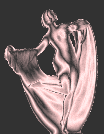
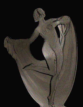
On 11/12/2013 3:43 PM, Rik Cabanier wrote:
> On Mon, Dec 9, 2013 at 11:02 PM, Alan Gresley <alan@css-class.com> wrote:
>
>> The Windows 7 Aero environment effect for a backdrop is not blurring but
>> diffusing. This is used by special camera lenses that are called diffusion
>> filters [3] which causes light scattering [4]. The blur effects that are
>> used in graphic arts programs emulate this diffusion effect and call it
>> blurring [5].
>>
>>    | The visual effect of this blurring technique is a
>>    | smooth blur resembling that of viewing the image
>>    | through a translucent screen.
>>
>> The effect can be achieved now but controversially (due to security
>> issues) by way of using element(). Please view in Firefox.
>>
>> http://css-class.com/test/css/3/image/blurred-diffused-backdrop.htm
>>
>> This could have been done easier if Firefox supported 'filter: blur()'
>> which could have been applied to a hidden referenced element and used as
>> the first layer or final layer in background-image (depending on the
>> construction).
>
>
> The issue is that you as author would have to know what exactly is behind
> the elements.

That is not the issue. You could have *paint-me* on many elements. The
major drawback in this approach is the very reason why it can be easily
done and this is because the animation of the element and the 'paint-me'
canvas are all done using percentages (if the element had dimensions in
pixels, you would use pixels).

Please note that the element with the 'id="chrome"' has a border (1px).
This had to be compensated by using a negative margin (-1px). Adding
padding either by pixels, ems or possibly even percentages would make it
unworkable (due to the box model).

> What if there was more than 1 element behind you, or if that element was
> scrolling?

You could have many elements behind you (or one element behind another
element with the effect). The background value 'element()' paints the
whole tree and the 'id="chrome"' element was part of the tree. The most
recent demo may have indeed be double compositing itself. I still need
to debug it. I know for a fact that the aero blue was double compositing
since an error when making the demo revealed an area of the aero
transparent gradient that was twice as dark.

When you say, "if that element was scrolling?", do you mean if it had
overflow:auto on it? If so, it makes no difference. A new demo with
overflowing content.

http://css-class.com/test/css/3/image/blurred-diffused-backdrop-overflow.htm

This new demo has be constructed in a different manner by using a hidden
canvas that is reference as a background layer of the 'id="chrome"'
element. I didn't have to used 'filter: blur().

I note that the diagonal movement are not as smooth as the most recent
demo. It makes me wonder if I had introduced a form of dithering by way
of possible double compositing in the other demo.

>> On 6/12/2013 3:42 PM, Rik Cabanier wrote:
>>
>>   In going with Lea's comment that authors equate backdrop with blending, I
>>> propose the following new property:
>>>
>>> backdrop-blur: none | <length>
>>>
>>> Length would be the parameter passed into the blur() filter [1].
>>>
>>
>> The property 'backdrop-blur' can *not* be allowed to create a stacking
>> context since this would effect the painting order. For each box
>> (inline-level and block-level), you would want to paint the 'backdrop-blur'
>> as the final painting layer of an element.
>>
>> Like so (from bottom to top in painting order):
>>
>>    1. backdrop-blur of element.
>>
>>    2. box-shadow of element.
>>
>>    3. background color of element.
>>
>>    4. background image of element.
>>
>>    5. border of element.
>>
>
> That would be if you see backdrop-blur as an additional draw step (which
> was my first proposal).

Authors using CSS would welcome a additional draw step since using
composite layers (when using any transparency) makes sense. Many authors
can create brilliant website without knowing anything about Apppendex E
[8] which describes 'stacking context' and 'painting order' in fine detail.

> The main problem is that the blurred backdrop would cover more than is
> wanted.

Can't you just clip it or do I have know idea about implementation.

> Another possible drawback is that you usually want to blend with this
> backdrop which will require additional css keywords.

Are you thinking of something beyond the 'Windows 7 Aero environment
effect'? If backdrop is a new element layer (below box-shadow), why are
you concerned with keywords? Can't you just use both 'backdrop-blur' or
'backdrop' together with 'mix-blend-mode' or 'background-blend-mode' or
am I just confused?

> I'm also worried that
> opacity or a transition with opacity will look weird.

How would it look weird?

>> It's only in §7.2.3 of the editors draft of 'CSS Backgrounds and Borders
>> Module Level 3' that this painting is finally in the spec [6] .
>>
>>    | Shadows do not influence layout and may overlap
>>    | other boxes or their shadows.
>>
>>
>> A demo of the painting order is found here [7].
>>
>>
>>>  Specifying this parameter in combination with mix-blend-mode[2], would
>>> blur
>>> the backdrop that is available during the blending step. Compositing would
>>> happen as usual.
>>>
>>
>> How? Doesn't mix-blend-mode caused blending and doesn't blending create a
>> stacking context or am I confusing creating a stacking context with
>> isolation.
>
>
> yes. No, you are not confused; I'm not being clear. :-)

And it's happening again. :-)

> mix-blend-mode today consists of a blend step that calculate a new color,
> followed by source-over that composites that color.

I finally getting it. For me, 'mix-blend-mode' blends all the
source-under layers (right to the :root element) and superimposes that
on top as a new composite layer and/or color. It's like mixing or
masking the RGB channels depending on the value for 'mix-blend-mode'
used and also the colors present for a particular element that
'mix-blend-mode' is applied to.

The following demo taught me that additional layers like
'rgba(255,255,255.0.5)', 'rgba(127,127,127.0.5)' or rgba(0,0,0.0.5)
above the lowest background layer makes all the examples work (there was
no bug in Firefox Nightly).

http://css-class.com/test/css/3/filter/figurine-mix-blend-mode.htm

> My proposal was to blur the backdrop that is available during blending, but
> composite with the regular backdrop.

What type of blending are you proposing? Is this a 'mix-blend-mode'
mode? Would it look like the following demo (same as above but with a
blurred backdrop)? Perhaps not...

http://css-class.com/test/css/3/filter/figurine-mix-blend-mode-blur-2a.htm

The 'color-dodge' example with settings of 'blur 2' or 'blur 3' with the
'black' layer looks nice when resizing the width of the viewport. It
looks like back light rippling down the edge of the cloak and across the
body. Is this what you meant by back-lighting?

Is there a way for authors to mask the outline of the figurine so only
the light came through the figurine instead of the current viewing box?

The 'difference' and 'exclusion' examples are on another page due to
some re-flow bug when scrolling of resizing the viewport.

> I created a test version of firefox that always blurs during blending:
> http://ftp.mozilla.org/pub/mozilla.org/firefox/try-builds/cabanier@adobe.com-b41a4f3aa1b3/try-win32/firefox-28.0a1.en-US.win32.tests.zip
> You can try it out with this page: http://cdpn.io/nmfic

So is that what was supposed to be tested with that build? A SVG?

> The algorithm isn't ready yet but it should give you an idea on the general
> feel.
 >
>>>  An alternate would be to extend mix-blend-mode so you can write the
>>> following:
>>>
>>> mix-blend-mode: screen blur(10px);
>>>
>>
>> I thinking it would be confusing since mix-blend-mode acts of the element
>> itself and not it's backdrop.
>>
>
> With the current proposal, backdrop blurring would ONLY happen if there's
> blending. It might be surprising to authors that a property does nothing by
> itself (but I could be wrong).

But if there's blending, doesn't that color the foreground?

>> I still do not know the difference between 'mix-blend-mode',
>> 'background-blend-mode' or 'isolation' but I'm still learning the wonders
>> of SVG.
>
>
> mix-blend-mode = blend the entire element with its parent stacking context
> (similar to css opacity)

Does this effect the z-index?

> background-blend-mode = specify how background images blend with each other
> isolation = turn this element into a stacking context.

It finally occurred to me last night what background-blend-mode does.
For years, I have been compositing layers to get close to that effect.
It gives me much to consider about how things can be done.

>>>  This can still be made compatible with future additions that target parts
>>> of an element.
>>>
>>> I'm in the process of creating an experimental windows-only build of
>>> firefox that implements.
>>>
>>> Thoughts?
>>>
>>
>> Can 'backdrop-blur' be simply 'backdrop' since there are other effects
>> that are not a simple blur.
>>
>> backdrop: none | blur(<length>) | ?
>>
>
> Yes, if there are more filters, that would be the way to go.

It would make it future proof and more versatile.

>> These are similar to what I find in my simple graphic arts program that
>> has charcoal, chrome, colored edges (without any blurring) which are
>> granular in appearance. Another effect could be feedback.
>>
>
> Do you have examples where these are used as backdrop filters?

Only what I see in my graphic arts program.

See attachment 'figurine-chrome.png' for chrome.

See attachment 'figurine-colored-edges.png' for colored edges. It was
set with no blur. It has a speckled appearance.

>> Can blur itself be magnified and can the x and y offsets be of different
>> values?
>
>
> You mean blur in x and y? Sure that is possible.

Sound Good. :-)

>>> 1: http://www.w3.org/TR/filter-effects/#funcdef-blur
>>> 2: http://dev.w3.org/fxtf/compositing-1/#mix-blend-mode
>>>
>> 3. http://en.wikipedia.org/wiki/Diffusion_filter
>> 4. http://en.wikipedia.org/wiki/Light_scattering
>> 5. http://en.wikipedia.org/wiki/Gaussian_blur
>> 6. http://dev.w3.org/csswg/css-backgrounds/#shadow-layers
>> 7. http://css-class.com/test/temp/shadow-painting-order.htm
8. http://www.w3.org/TR/2011/REC-CSS2-20110607/zindex.html


Alan


--
Alan Gresley
http://css-3d.org/
http://css-class.com/
Attachments
- image/png attachment: figurine-chrome.png
- image/png attachment: figurine-colored-edges.png
Received on Thursday, 12 December 2013 14:39:07 UTC